


A new experience every month
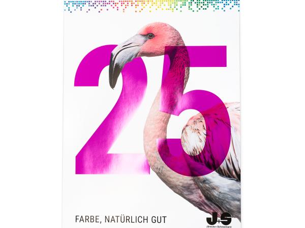
Frank Denninghoff, Managing Director of Gräfe Druckveredelung GmbH, on the stunning 2020 Jänecke + Schneemann annual calendar.
It’s impressive. Not just because of its size, but also because of its motifs – designed for the third time by Gräfe Druckveredelung GmbH, the wall calendar by Jänecke + Schneemann Druckfarben GmbH is breathtaking. At the Gregor Award of Excellence in 2019, its predecessor won the ‘Special Award for Excellent Production and Finishing’ with the judging panel describing the lavish calendar as a ‘masterpiece of printing technology’.
Showcasing the whole gamut of finishing options
It is immediately evident that Frank Denninghoff, a passionate finishing expert, has a particular fondness for this calendar project. ‘Simply put, we want this calendar to blow the minds of our customer Jänecke + Schneemann and their own customers’, he says. The design and variety of finishing effects also serve to boost the colour radiance of the Jänecke + Schneemann printing ink brand. This calendar is among a handful of other projects that is pretty much able to showcase the whole gamut of craftsman finishes.
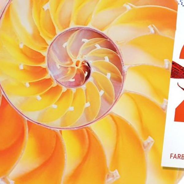
The title of the calendar is the same as last year, ‘Farbe, tierisch gut’. Twelve animal motifs illustrate the creative diversity of nature, sometimes even succeeding in surpassing it. Brilliant printing inks, soft-touch varnishes and a variety of print finishes create an expressive setting for every animal. ‘The basic idea for this calendar has evolved over the years,’ explains Denninghoff. But creating a new twist for it every year is equally as important.
This is the first year that Sappi’s brilliant white, premium solid bleached board Algro Design has been used for the calendar. ‘We love this paper at Gräfe’, says Denninghoff. Besides the high degree of brightness this substrate offers, he also appreciates that it can be easily embossed and shaped and is ideal for cold foil transfer. The Algro Design has a grammage of 330 grammes per square metre, especially chosen so that even after being handled dozens of times the feel and strength of the calendar on the wall is still impressive.
Superior value and yet cost-effective
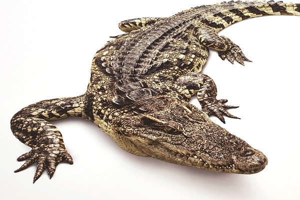
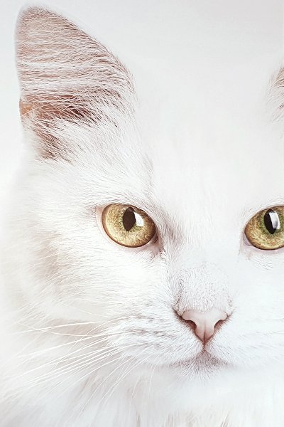
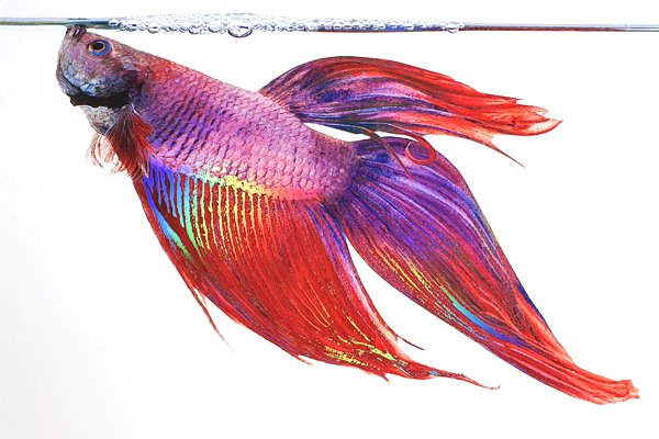
The carefully selected motifs and colours of the calendar reflect the season. For example, the calendar page for January displays a snow-white cat. Matt primer was applied to the surface of the paperboard to create a sense of subtle sophistication and elegance. The crocodile on the August calendar page is yet another highlight. The multi-stage blind embossing with partial UV gloss varnish produces a stunning and extremely realistic 3D effect. No less impressive are the countless layers of shimmering red on the scales of the fighting fish that adorn the October page of the calendar. Transparent colours to the air bubbles along the waterline add an air of authenticity.
The vibrant colours also convey the rich quality of the colours – the hallmark of the printing ink manufacturer Jänecke + Schneemann. The finishings used in the printing process for this calendar are by no means an end in themselves, Denninghoff is quick to point out. ‘The chosen finish should always complement the idea, bringing out the colours so that the end product stimulates the customer’s senses to an even greater degree.’
Although the wall calendar looks sumptuous and extremely expensive, considerable attention was paid to cost-effectiveness during production. For example, the calendar was produced using a mere seven printing plates, always with two motifs set on one form (70/100) at the same time. As Denninghoff puts it, the aim of the project is to develop a reference product that demonstrates to the printing target group the possibilities of combining first-class printing inks, masterly finishing techniques and an excellent substrate despite a limited budget. And Denninghoff’s project partner Christian Jänecke from Jänecke + Schneemann adds: ‘The production has been a huge hit. I’ve gifted it to customers around the world and the feedback has been overwhelmingly positive.’ ‘We wanted a result which clearly reflects the love, commitment, intelligence and expertise that went into its development,’ says Frank Denninghoff. And there can be no question that the entire team has indeed pulled it off superbly.
The project partners:
The designers at Gräfe Atelier were responsible for the design, editing and repress stage of the calendar project. Gräfe Druckveredelung carried out the implementation and production. The colour specialists Jänecke + Schneemann provided all the printing inks. Sappi supplied the premium solid bleached board Algro Design 330 grammes per square metre.